Flutter中的四种布局控件
1.Align组件
概述
一般来说,Align的使用都是其他控件的一个参数,目的是为了设置子child的对齐方式,比如居中,左上,右下等多个对齐方向,其本身用法也多灵活。
构造函数
const Align({
	Key key,
	this.alignment = Alignment.center,
	this.widthFactor,
	this.heightFactor,
	Widget child
})
alignment 设置对齐方向,使有多种使用方式:
比如:FractionalOffset(0.5, 0.5)==Alignment(0.0,0.0)==Alignment.center,都是将子child居中对齐的控制方式Alignment(0.0,0.0)表示矩形的中心。从-1.0到+1.0的距离是矩形的一边到另一边的距离。
而Alignment中还可以这样使用对齐方式的控制,也是较为常用的使用方式:即本质就是类似于语法糖将各个方向的对齐方式简单封装了下。
FractionalOffset(1, 1) 类似Alignment() 但是坐标起点是左上角,且范围为0~1 比如 FractionalOffset(0.5, 0.5) 代表中间位置widthFactor 如果非空,则将其宽度设置为子元素的宽度乘以该因子,可以大于或小于1.0,但必须是正数。
heightFactor 如果非空,则将其高度设置为子元素的高度乘以该因子,可以大于或小于1.0,但必须是正数。
2.Expanded组件
按比例将父容器分成若干份!!!!!!
Row(
  children: <Widget>[
    Expanded(
      child: Container(
        color: Colors.red,
        padding: EdgeInsets.all(5.0),
      ),
      flex: 1,
    ),
    Expanded(
      child: Container(
        color: Colors.yellow,
        padding: EdgeInsets.all(5.0),
      ),
      flex: 2,
    ),
    Expanded(
      child: Container(
        color: Colors.blue,
        padding: EdgeInsets.all(5.0),
      ),
      flex: 1,
    ),
  ],
)
一个很简单的例子,使用Expanded控件,将一行的宽度分成四个等分,第一、三个child占1/4的区域,第二个child占1/2区域,由flex属性控制。
3.Row组件
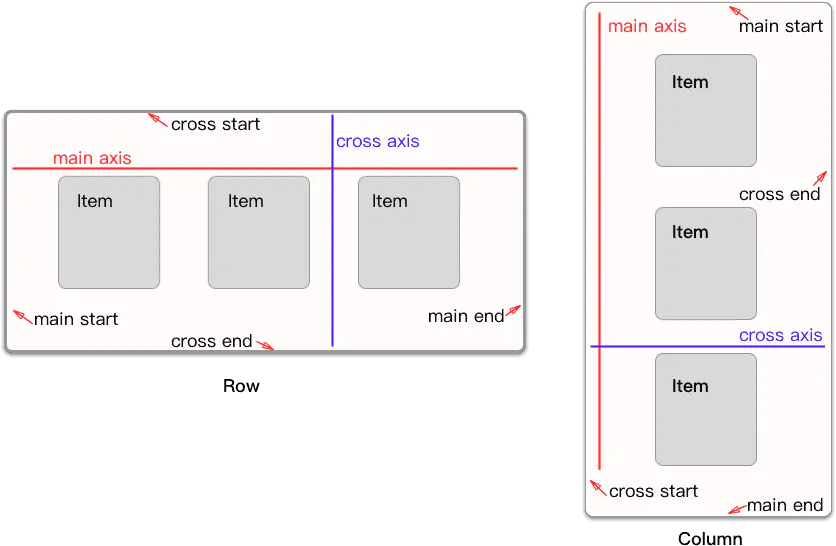
源码解析
Row({
  Key key,
  MainAxisAlignment mainAxisAlignment = MainAxisAlignment.start,
  MainAxisSize mainAxisSize = MainAxisSize.max,
  CrossAxisAlignment crossAxisAlignment = CrossAxisAlignment.center,
  TextDirection textDirection,
  VerticalDirection verticalDirection = VerticalDirection.down,
  TextBaseline textBaseline,
  List<Widget> children = const <Widget>[],
})
MainAxisAlignment
主轴方向上的对齐方式,会对child的位置起作用,默认是start。
其中MainAxisAlignment枚举值:
- center:将children放置在主轴的中心;
- end:将children放置在主轴的末尾;
- spaceAround:将主轴方向上的空白区域均分,使得children之间的空白区域相等,但是首尾child的空白区域为1/2;
- spaceBetween:将主轴方向上的空白区域均分,使得children之间的空白区域相等,首尾child都靠近首尾,没有间隙;
- spaceEvenly:将主轴方向上的空白区域均分,使得children之间的空白区域相等,包括首尾child;
- start:将children放置在主轴的起点;
其中spaceAround、spaceBetween以及spaceEvenly的区别,就是对待首尾child的方式。其距离首尾的距离分别是空白区域的1/2、0、1。
MainAxisSize
在主轴方向占有空间的值,默认是max。
MainAxisSize的取值有两种:
- max:根据传入的布局约束条件,最大化主轴方向的可用空间;
- min:与max相反,是最小化主轴方向的可用空间;
CrossAxisAlignment:children在交叉轴方向的对齐方式,与MainAxisAlignment略有不同。
CrossAxisAlignment枚举值有如下几种:
- baseline:在交叉轴方向,使得children的baseline对齐;
- center:children在交叉轴上居中展示;
- end:children在交叉轴上末尾展示;
- start:children在交叉轴上起点处展示;
- stretch:让children填满交叉轴方向;
TextDirection:阿拉伯语系的兼容设置,一般无需处理。
VerticalDirection:定义了children摆放顺序,默认是down。
VerticalDirection枚举值有两种:
- down:从top到bottom进行布局;
- up:从bottom到top进行布局。
top对应Row以及Column的话,就是左边和顶部,bottom的话,则是右边和底部。
TextBaseline:使用的TextBaseline的方式,有两种,前面已经介绍过。
关于Flex的构造函数
Flex({
  Key key,
  @required this.direction,
  this.mainAxisAlignment = MainAxisAlignment.start,
  this.mainAxisSize = MainAxisSize.max,
  this.crossAxisAlignment = CrossAxisAlignment.center,
  this.textDirection,
  this.verticalDirection = VerticalDirection.down,
  this.textBaseline,
  List<Widget> children = const <Widget>[],
})
可以看出,Flex的构造函数就比Row和Column的多了一个参数。Row跟Column的区别,正是这个direction参数的不同。当为Axis.horizontal的时候,则是Row,当为Axis.vertical的时候,则是Column。
4.Stack组件
Stack 这个是Flutter中布局用到的组件,跟Android中FrameLayout很像,都是可以叠加的现实View,具体的使用细节还是有些不同的,我们一一说来
Stack({
  Key key,
  this.alignment = AlignmentDirectional.topStart,
  this.textDirection,
  this.fit = StackFit.loose,
  this.overflow = Overflow.clip,
  List<Widget> children = const <Widget>[],
})
alignment : 指的是子Widget的对其方式,默认情况是以左上角为开始点 ,这个属性是最难理解的,它区分为使用了Positioned和未使用Positioned定义两种情况,没有使用Positioned情况还是比较好理解的,下面会详细讲解的
fit :用来决定没有Positioned方式时候子Widget的大小,StackFit.loose 指的是子Widget 多大就多大,StackFit.expand使子Widget的大小和父组件一样大
overflow :指子Widget 超出Stack时候如何显示,默认值是Overflow.clip,子Widget超出Stack会被截断,
Overflow.visible超出部分还会显示的
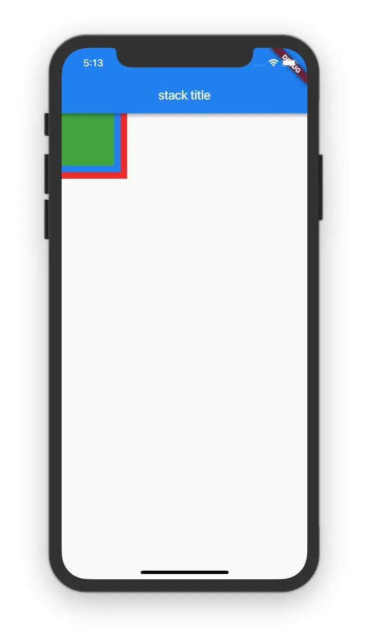
初探Stack组件的使用
import 'package:flutter/material.dart';
class StackScreen extends StatelessWidget{
@override
Widget build(BuildContext context) {
return Scaffold(
appBar: AppBar(
title: Text("stack title"),
),
body: Stack(
children: <Widget>[
Container(
width: 100,
height: 100,
color: Colors.red,
),
Container(
width: 90,
height: 90,
color: Colors.blue,
),
Container(
width: 80,
height: 80,
color: Colors.green,
),
],
),
);
}
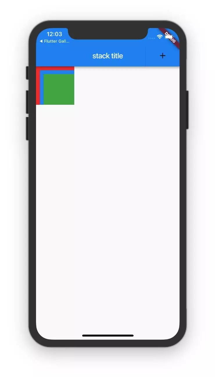
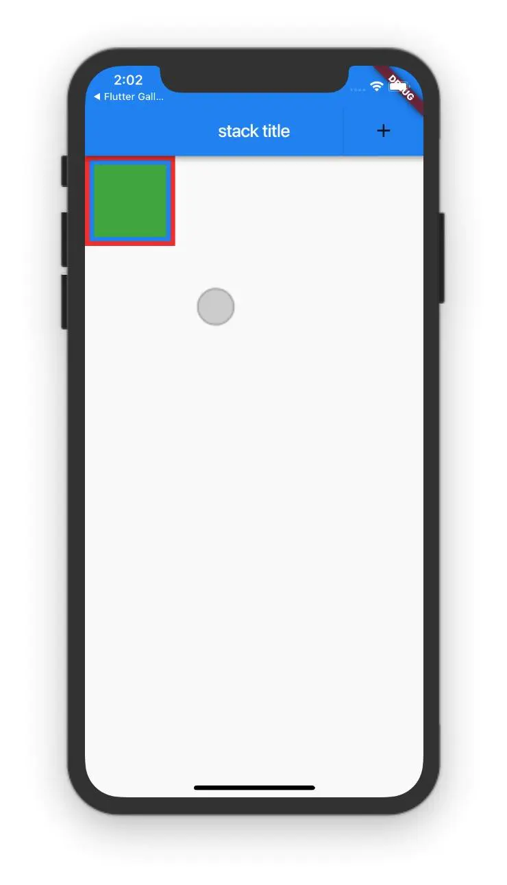
}上面的代码Stack做为根布局,叠加的方式展示3个组件,第一个组件比较大100100,第二个组件稍微小点90**90
,第三个组件最小80*80,显示的方式是能看见第一个和第二个组件的部分区域,第三个组件是能全部显示出来
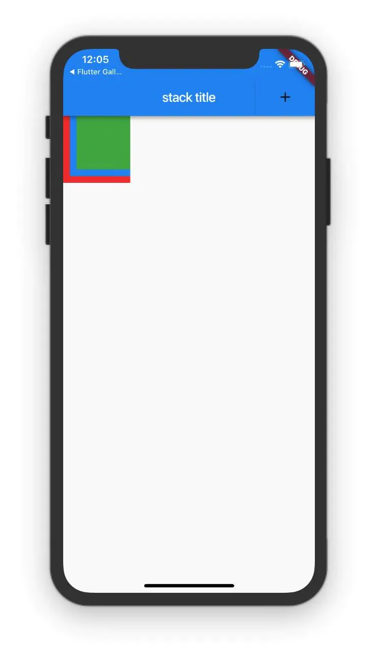
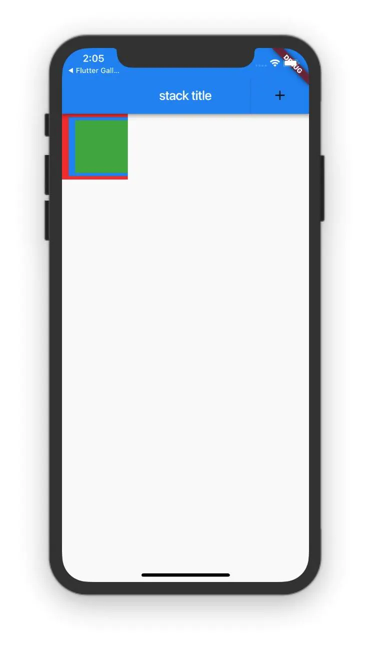
fit 属性使用
如果指定是StackFit.expand,所以的子组件会和Stack一样大的
class StackScreen extends StatelessWidget {
  @override
  Widget build(BuildContext context) {
    return Scaffold(
      appBar: AppBar(
        title: Text("stack title"),
        actions: <Widget>[
          RaisedButton(
            onPressed: () {
              Navigator.push(context,
                  MaterialPageRoute(builder: (context) => PositionScreen()));
            },
            color: Colors.blue,
            child: Icon(Icons.add),
          ),
        ],
      ),
      body: Stack(
        fit: StackFit.expand,
        children: <Widget>[
          Container(
            width: 100,
            height: 100,
            color: Colors.red,
          ),
          Container(
            width: 90,
            height: 90,
            color: Colors.blue,
          ),
          Container(
            width: 80,
            height: 80,
            color: Colors.green,
          ),
        ],
      ),
    );
  }
}
显示内容就只最后一个组件,虽然我们给这个组件指定了一个80*80的宽高是不会 生效的,因为我们已经指定了子元素和Stack一样大小,也就是说设置了StackFit.expand,StackFit.expand的效果优先
Positioned
这个使用控制Widget的位置,通过他可以随意摆放一个组件,有点像绝对布局
Positioned({
  Key key,
  this.left,
  this.top,
  this.right,
  this.bottom,
  this.width,
  this.height,
  @required Widget child,
})
left、top 、right、 bottom分别代表离Stack左、上、右、底四边的距离
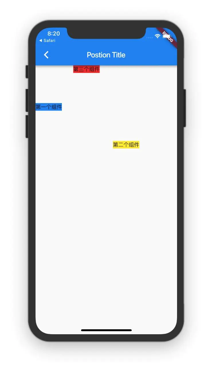
class PositionScreen extends StatelessWidget {
@override
Widget build(BuildContext context) {
return Scaffold(
appBar: AppBar(
title: Text("Postion Title"),
),
body: Stack(
children: <Widget>[
Positioned(
top: 100.0,
child: Container(
color: Colors.blue,
child: Text("第一个组件"),
),
),
Positioned(
top: 200,
right: 100,
child: Container(
color: Colors.yellow,
child: Text("第二个组件"),
),
),
Positioned(
left: 100.0,
child: Container(
color: Colors.red,
child: Text("第三个组件"),
),
),
],
),
);
}
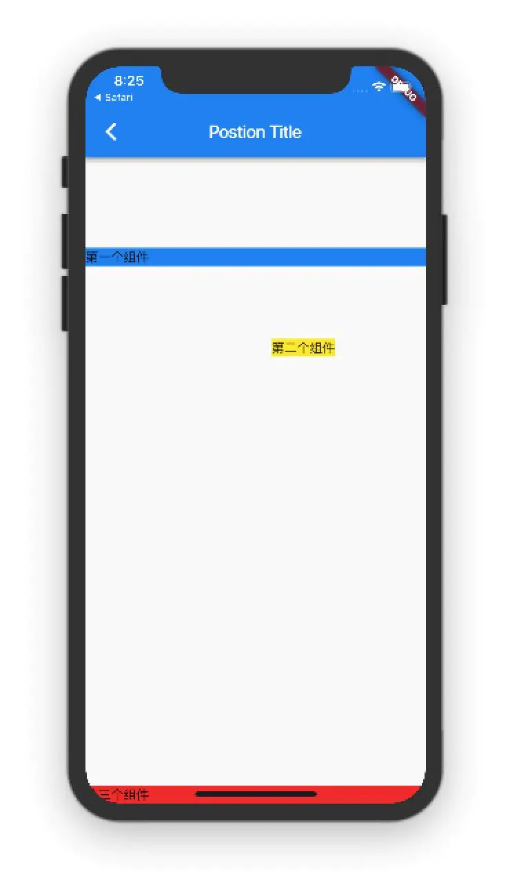
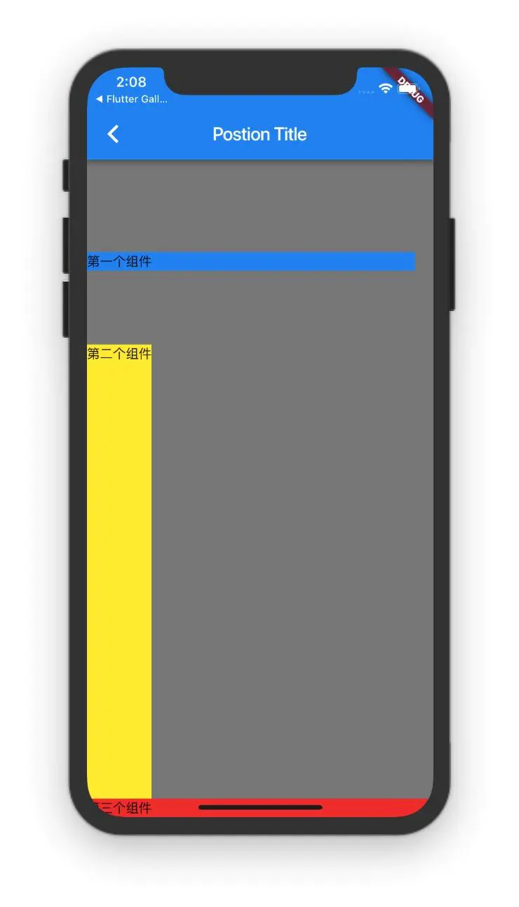
}这个例子的效果就是
- 第一个组件距离顶部Stack 有100的间距
- 第二个组件距离顶部200,距离右边100间距
- 第三个组件距离左边100间距
这个地方有注意地方,例如说第一个组件我指定距离左边0个距离,距离右边0个距离,那么这个组件的宽度就是屏幕这么宽,因为你指定的左右间距都是0,也就是没有间距
class PositionScreen extends StatelessWidget {
  @override
  Widget build(BuildContext context) {
    return Scaffold(
      appBar: AppBar(
        title: Text("Postion Title"),
      ),
      body: Stack(
        children: <Widget>[
          Positioned(
            top: 100.0,
            left: 0,
            right: 0,
            child: Container(
              color: Colors.blue,
              child: Text("第一个组件"),
            ),
          ),
          Positioned(
            top: 200,
            right: 100,
            child: Container(
              color: Colors.yellow,
              child: Text("第二个组件"),
            ),
          ),
          Positioned(
            bottom: 0,
            left: 0,
            right: 0,
            child: Container(
              color: Colors.red,
              child: Text("第三个组件"),
            ),
          ),
        ],
      ),
    );
  }
}
第一个组件和第三个组件宽度都是整个屏幕这个宽度,第三组件我又指定了距离底部bottom为0,所以第三组件是在最底下
那么我们如果指定了left&&right&&top&bottom都是0的情况呢?
那么这个组件就是和Stack大小一样填满它
class PositionScreen extends StatelessWidget {
  @override
  Widget build(BuildContext context) {
    return Scaffold(
      appBar: AppBar(
        title: Text("Postion Title"),
      ),
      body: Stack(
        children: <Widget>[
          Positioned(
            left: 0,
            top: 0,
            right: 0,
            bottom: 0,
            child: Container(
              color: Colors.black45,
            ),
          ),
          Positioned(
            top: 100.0,
            left: 0,
            right: 0,
            child: Container(
              color: Colors.blue,
              child: Text("第一个组件"),
            ),
          ),
          Positioned(
            top: 200,
            right: 100,
            child: Container(
              color: Colors.yellow,
              child: Text("第二个组件"),
            ),
          ),
          Positioned(
            bottom: 0,
            left: 0,
            right: 0,
            child: Container(
              color: Colors.red,
              child: Text("第三个组件"),
            ),
          ),
        ],
      ),
    );
  }
}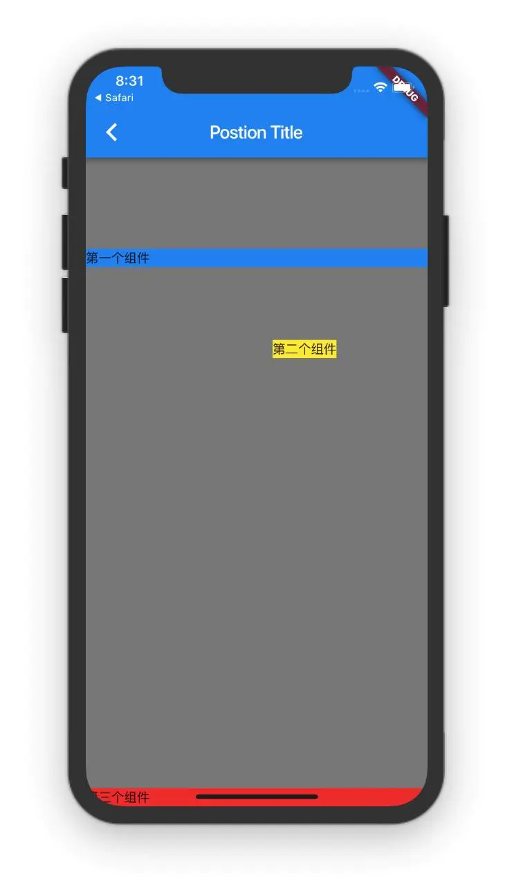
为了演示这个效果,我在第一个组件上加上了一个黑色的标记,代码中添加的第一组件就是和Stack一样大的,系统也提供了一个方法Positioned.fill 这个方法的效果和图片上是一样的
class PositionScreen extends StatelessWidget {
  @override
  Widget build(BuildContext context) {
    return Scaffold(
      appBar: AppBar(
        title: Text("Postion Title"),
      ),
      body: Stack(
        children: <Widget>[
          Positioned.fill(
            child: Container(
              color: Colors.black45,
            ),
          ),
          Positioned(
            top: 100.0,
            left: 0,
            right: 0,
            child: Container(
              color: Colors.blue,
              child: Text("第一个组件"),
            ),
          ),
          Positioned(
            top: 200,
            right: 100,
            child: Container(
              color: Colors.yellow,
              child: Text("第二个组件"),
            ),
          ),
          Positioned(
            bottom: 0,
            left: 0,
            right: 0,
            child: Container(
              color: Colors.red,
              child: Text("第三个组件"),
            ),
          ),
        ],
      ),
    );
  }
}
效果是等价的
alignment 属性理解
没有使用Positioned定位情况
在我们初探Stack组件中讲解的例子就是没有使用Positioned定位的情况,默认的子组件的对齐方式就是以左上角为起点开始排列子Widget
AlignmentDirectional.bottomEnd 对齐方式
所有的Widget 以Stack的右下角为起点开始对齐
class StackScreen extends StatelessWidget {
  @override
  Widget build(BuildContext context) {
    return Scaffold(
      appBar: AppBar(
        title: Text("stack title"),
        actions: <Widget>[
          RaisedButton(
            onPressed: () {
              Navigator.push(context,
                  MaterialPageRoute(builder: (context) => PositionScreen()));
            },
            color: Colors.blue,
            child: Icon(Icons.add),
          ),
        ],
      ),
      body: Stack(
//        fit: StackFit.expand,
       alignment: AlignmentDirectional.bottomEnd,
        children: <Widget>[
          Container(
            width: 100,
            height: 100,
            color: Colors.red,
          ),
          Container(
            width: 90,
            height: 90,
            color: Colors.blue,
          ),
          Container(
            width: 80,
            height: 80,
            color: Colors.green,
          ),
        ],
      ),
    );
  }
}
AlignmentDirectional.topEnd 对齐方式
所有的Widget 以Stack的右上角为起点开始对齐
class StackScreen extends StatelessWidget {
  @override
  Widget build(BuildContext context) {
    return Scaffold(
      appBar: AppBar(
        title: Text("stack title"),
        actions: <Widget>[
          RaisedButton(
            onPressed: () {
              Navigator.push(context,
                  MaterialPageRoute(builder: (context) => PositionScreen()));
            },
            color: Colors.blue,
            child: Icon(Icons.add),
          ),
        ],
      ),
      body: Stack(
//        fit: StackFit.expand,
       alignment: AlignmentDirectional.topEnd,
        children: <Widget>[
          Container(
            width: 100,
            height: 100,
            color: Colors.red,
          ),
          Container(
            width: 90,
            height: 90,
            color: Colors.blue,
          ),
          Container(
            width: 80,
            height: 80,
            color: Colors.green,
          ),
        ],
      ),
    );
  }
}
AlignmentDirectional.center 对齐方式
所有的Widget 以Stack的中心位置
AlignmentDirectional.centerEnd 对齐方式
所有的Widget 在Stack的中心位置并且右边跟stack右边挨着
使用Positioned情况下
class PositionScreen extends StatelessWidget {
  @override
  Widget build(BuildContext context) {
    return Scaffold(
      appBar: AppBar(
        title: Text("Postion Title"),
      ),
      body: Stack(
//        alignment: AlignmentDirectional.bottomEnd,
        overflow: Overflow.visible,
        children: <Widget>[
          Positioned.fill(
            child: Container(
              color: Colors.black45,
            ),
          ),
          Positioned(
            top: 100.0,
            left: 0,
            right: 20,
            child: Container(
              color: Colors.blue,
              child: Text("第一个组件"),
            ),
          ),
          Positioned(
            top: 200,
            bottom: 20,
            child: Container(
              color: Colors.yellow,
              child: Text("第二个组件"),
            ),
          ),
          Positioned(
            bottom: 0,
            left: 0,
            right: 0,
            child: Container(
              color: Colors.red,
              child: Text("第三个组件"),
            ),
          ),
        ],
      ),
    );
  }
}
这种情况是alignment 是默认值的效果,下面我们修改一下alignment的对应的值
AlignmentDirectional.bottomEnd
bottomEnd是子Widget的底部和Stack底部对齐,并且子Widget的右边和Stack右边对齐
class PositionScreen extends StatelessWidget {
  @override
  Widget build(BuildContext context) {
    return Scaffold(
      appBar: AppBar(
        title: Text("Postion Title"),
      ),
      body: Stack(
        alignment: AlignmentDirectional.bottomEnd,
        overflow: Overflow.visible,
        children: <Widget>[
          Positioned.fill(
            child: Container(
              color: Colors.black45,
            ),
          ),
          Positioned(
            top: 100.0,
            left: 0,
            right: 20,
            child: Container(
              color: Colors.blue,
              child: Text("第一个组件"),
            ),
          ),
          Positioned(
            top: 200,
            bottom: 20,
            child: Container(
              color: Colors.yellow,
              child: Text("第二个组件"),
            ),
          ),
          Positioned(
            bottom: 0,
            left: 0,
            right: 0,
            child: Container(
              color: Colors.red,
              child: Text("第三个组件"),
            ),
          ),
        ],
      ),
    );
  }
}
显示效果
大家会发现这个图的效果和上一个图的效果唯一区别就是黄色的第二个组件的位置有变化,这是为什么呢?
先说第一个组件和第三组件的位置为什么没有改变
Positioned(
            top: 100.0,
            left: 0,
            right: 20,
            child: Container(
              color: Colors.blue,
              child: Text("第一个组件"),
            ),
          ),

          Positioned(
            bottom: 0,
            left: 0,
            right: 0,
            child: Container(
              color: Colors.red,
              child: Text("第三个组件"),
            ),
          ),
第一个组件top是100,说明这个组件距离顶部的距离是固定的,虽然Stack的aligment=AlignmentDirectional.bottomEnd,是不生效的,当这两个属性冲突时,以Positioned的距离为主,为什么第一组件右边也没有Stack的右边对齐呢?因为right=20,第一个组件右边距离已经可以确认了,所以也不受到aligment=AlignmentDirectional.bottomEnd的影响
第三个组件也是一样的,第三个组件的宽度是Stack的宽度,高度取决于Text组件的高度,最关键的是它的bottom=0,也就是第三个组件要和Stack组件的低边界对齐,所以它的效果和上面的图是没有变化的
Positioned(
top: 200,
bottom: 20,
child: Container(
color: Colors.yellow,
child: Text("第二个组件"),
),
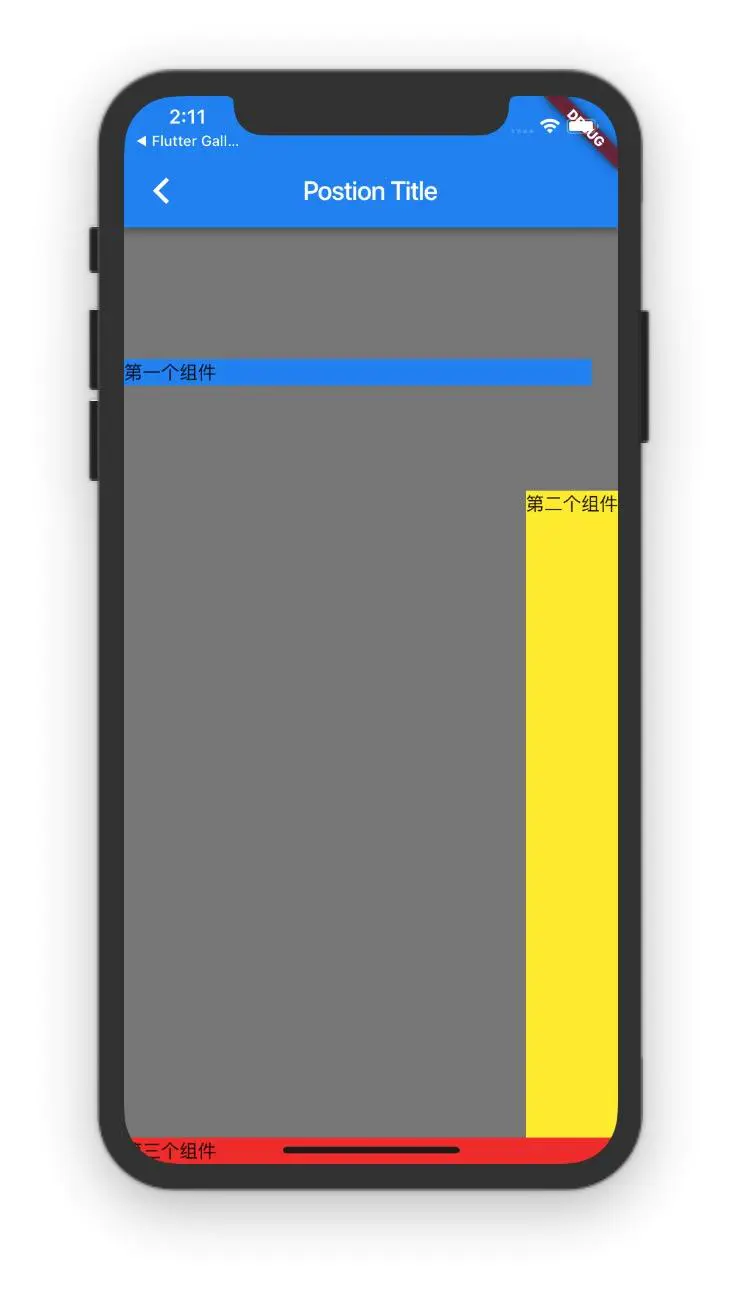
),第二个组件为什么会跑到右边呢?
因为第二个组件的高度是可以确认出来的,top=200,bottom=20,设置这两个属性就能推断出第二组的高度是多大,但是第二个组件的宽度取决于Text(“第二个组件”) 的宽度,显然是水平方向上是不能填满Stack的,这个时候AlignmentDirectional.bottomEnd属性起作用了,bottom的距离已经确定了,所以底部的对齐方式是不会变化了,但是第二组件右边的对齐方式是可以收到AlignmentDirectional.bottomEnd影响的,所以第二组件展示的位置就是图片上展示的位置
总结一下使用Positioned 定位方式aligment 方式对它的影响
Positioned 有四个属性top、bottom、left、right,(top、bottom)决定了垂直方向上的位置了,(left、right)决定了水平方向上的位置,不管水平方向上还是垂直方向上只要设定了一个值该方向上位置就已经确定过了,aligment对这这个方向上就不会起作用了,如果Positioned 设置了其中任意三个方向的值,这个Widget的位置就是固定的,aligment对它不会起任何作用
本博客所有文章除特别声明外,均采用 CC BY-SA 4.0 协议 ,转载请注明出处!